Lash Sensational Firework Electro Black Máscara
Lash Sensational Firework Electro Black Máscara
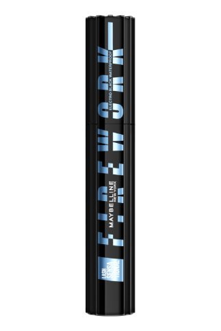
Electro Black
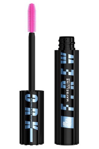
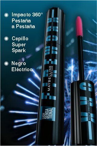
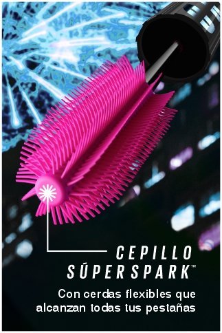
Presentamos LASH SENSATIONAL™ FIREWORK ELECTRO BLACK, nuestra primera máscara para un efecto 360 grados pestaña por pestaña tipo fuegos artificiales. El cepillo SuperSpark™ tiene cerdas en un patrón espiral como fuegos artificiales para disparar las pestañas hacia arriba y hacia afuera. Fórmula en gel, con Pro-Vitamina B5, para una cobertura construible y resistente a grumos. Las pestañas se sienten acondicionadas. Resiste el desvanecimiento y descamación. Dura hasta 24 horas. A prueba de agua. Probado bajo control dermatológico. Probado bajo control oftalmológico. Adecuado para ojos sensibles. Adecuado para usuarios que usan lentes de contacto.